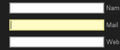
Actually, the native widgets only look terrible if you’re on Linux with certain gtk+ themes and you’re viewing a web site with a dark background. Unfortunately, all of those conditions apply to me. See below:

As you can see, there’s an ugly white box around the otherwise rounded widgets. Originally, I thought my CSS was lacking, but after hours–literally–of googling I determined that Firefox’s implementation of gtk+ widgets is just shoddy. Of course, on a site with a white background, they look great. I’m reminded of that Henry Ford quote: “Any customer can have a car painted any colour that he wants as long as it is black.”
Applying any styling to the input elements will completely disable the native widgets. I ended up writing some basic CSS:
input, textarea { border: 2px solid #888888; }
input:focus, textarea:focus {
	border-color: #D9D27C;
	background-color: #FFFBC4;
}
They don’t look nearly as good as native widgets on a white background, but they look a whole lot better than native widgets on my site. See below:

I also added some input focus bling to the form:

Even though they look alright now, I’ve decided that my next major project on my blog should be a complete theme redesign. Traditional color schemes are easier to work with and I’ll also get familiar with a lot of WordPress PHP code.
1 reply on “Firefox 3 Native Form Widgets Look Terrible”
I just read in some forum that “-moz-appearance: none;” does the trick, too.